Weir Group
Weir Group
Weir Group
A fresh format for a global mining technology report.
A fresh format for a global mining technology report.
Design Direction • Annual Report • Editorial Layout
Design Direction • Annual Report • Editorial Layout
Design Direction • Annual Report •
Editorial Layout
Whilst at: Radley Yeldar
Whilst at: Radley Yeldar
Brief
Brief
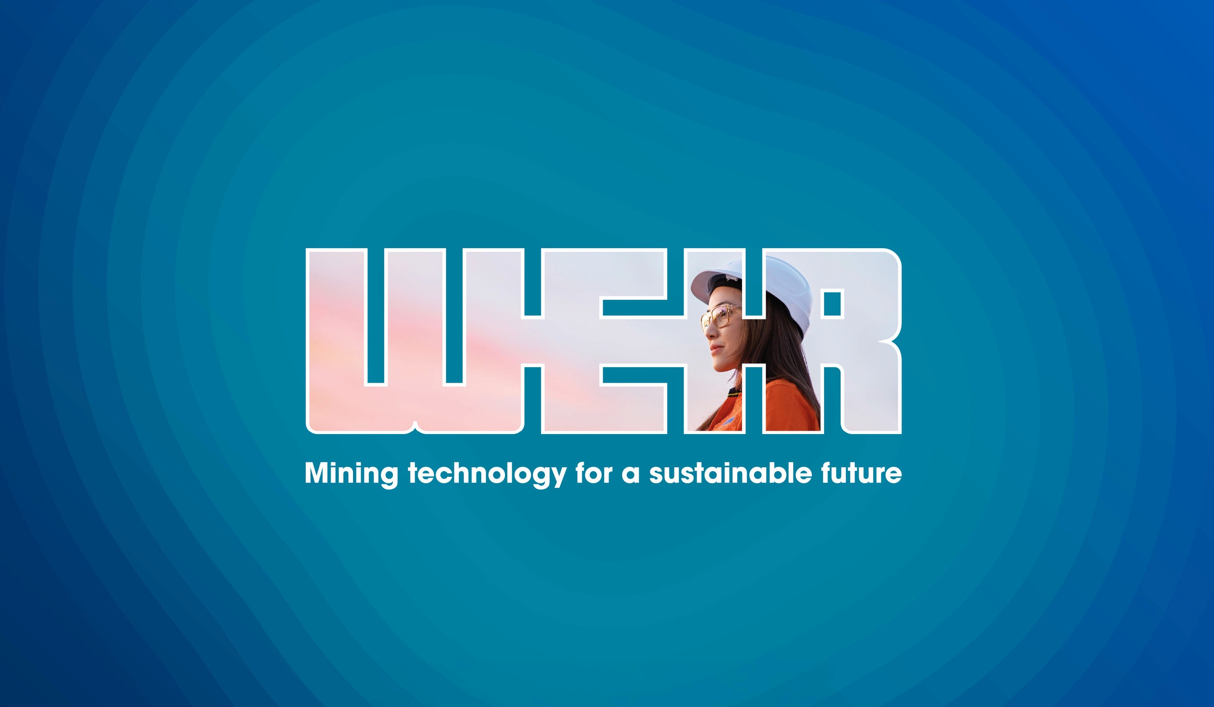
To design Weir’s annual report, applying its updated brand identity while reinforcing the company’s positioning around “Mining technology for a sustainable future.”
The aim was to balance strong corporate storytelling with clarity, accessibility and reporting requirements, while making complex information engaging and easy for stakeholders to navigate.
To design Weir’s annual report, applying its updated brand identity while reinforcing the company’s positioning around “Mining technology for a sustainable future.”
The aim was to balance strong corporate storytelling with clarity, accessibility and reporting requirements, while making complex information engaging and easy for stakeholders to navigate.
To design Weir’s annual report, applying its updated brand identity while reinforcing the company’s positioning around “Mining technology for a sustainable future.”
The aim was to balance strong corporate storytelling with clarity, accessibility and reporting requirements, while making complex information engaging and easy for stakeholders to navigate.
My approach
My approach
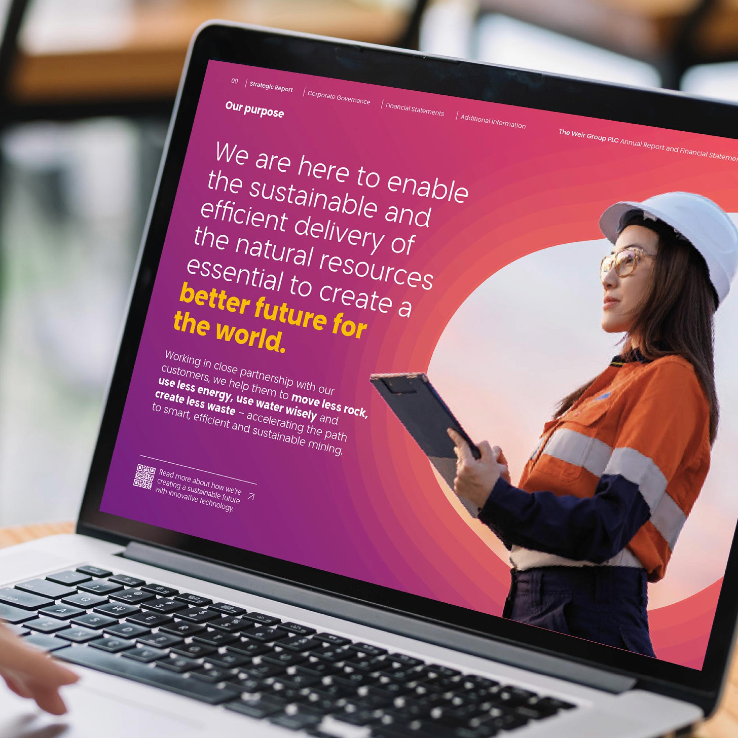
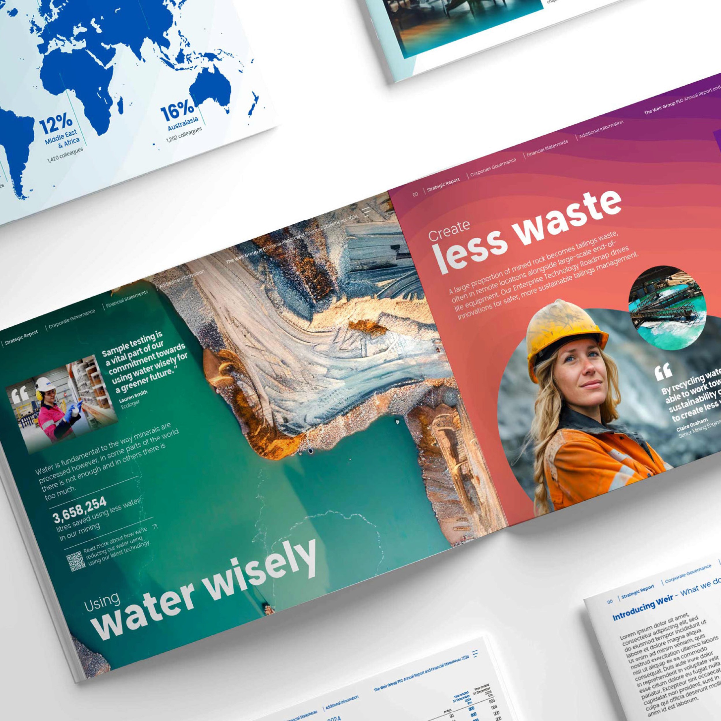
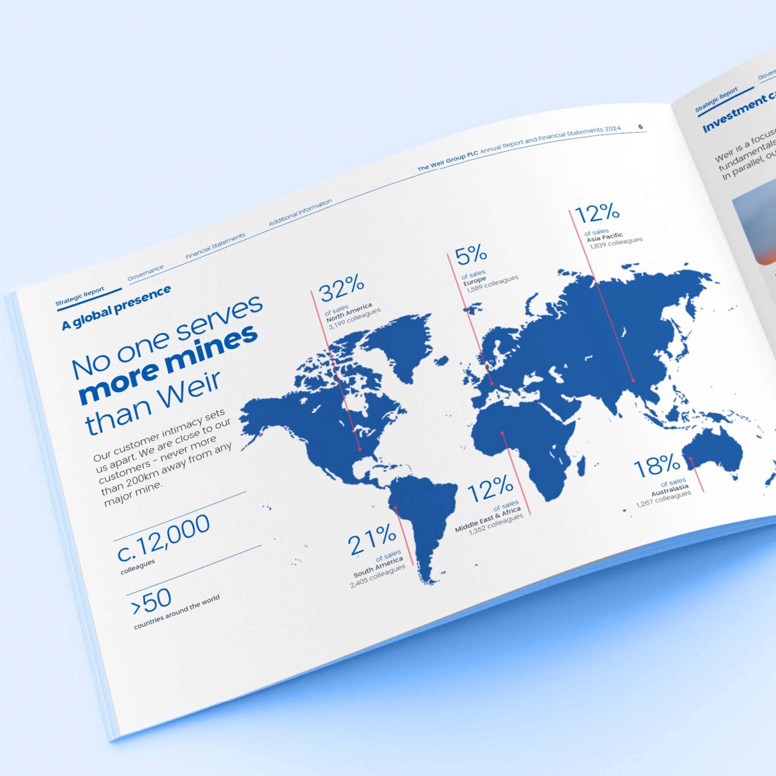
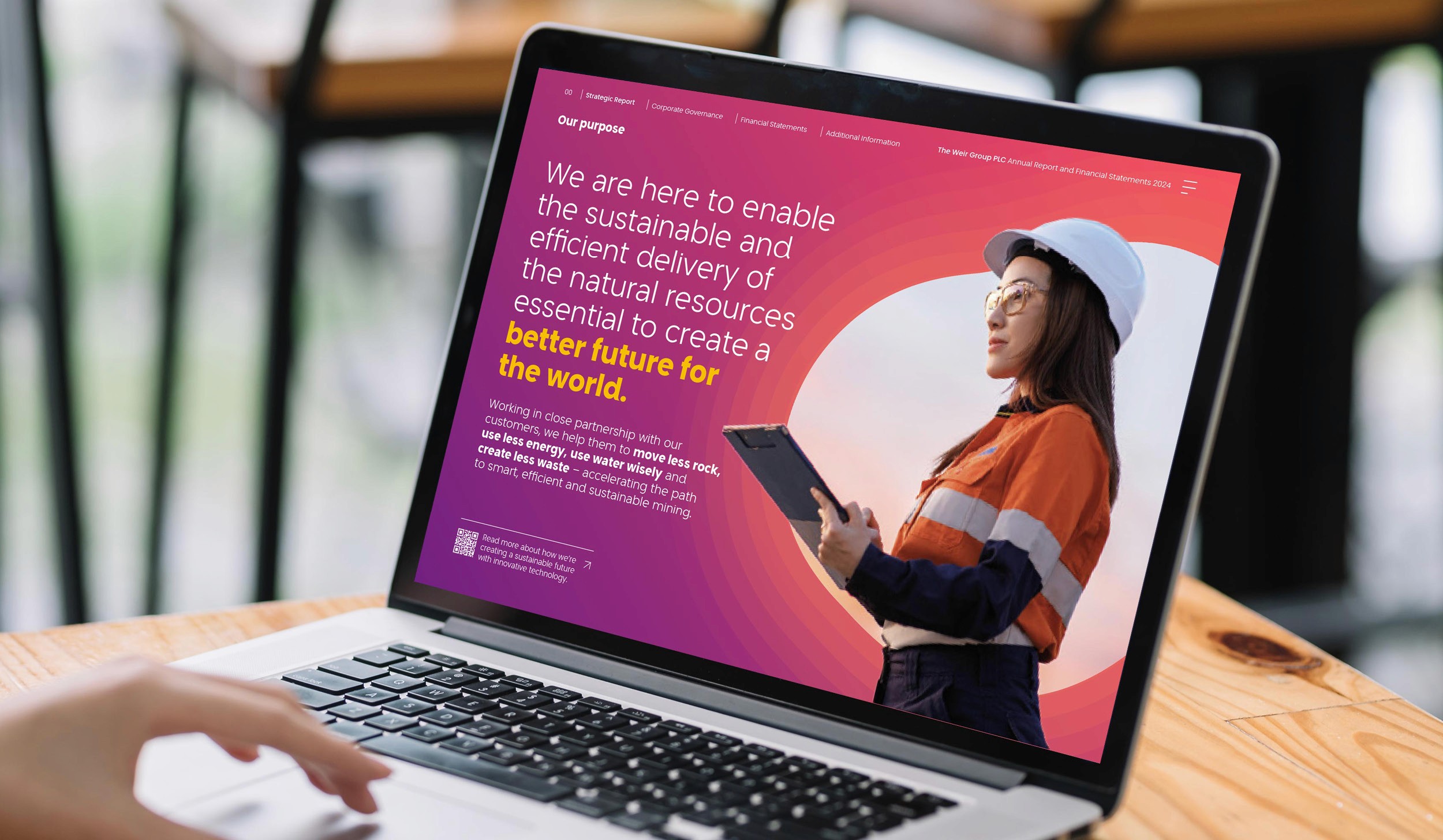
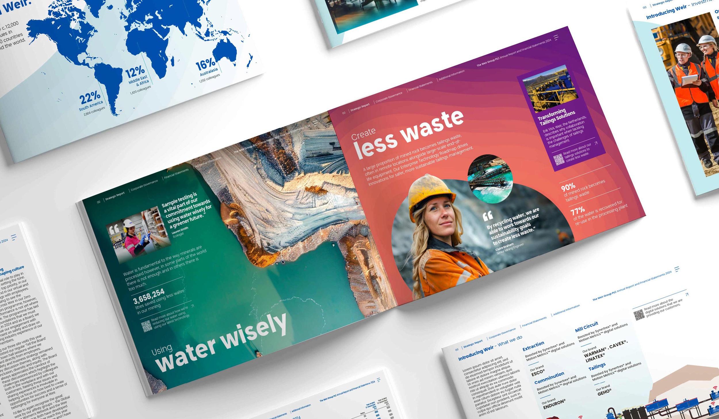
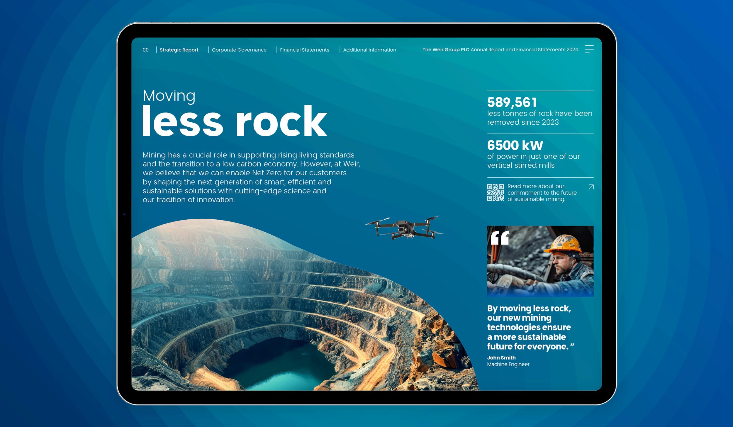
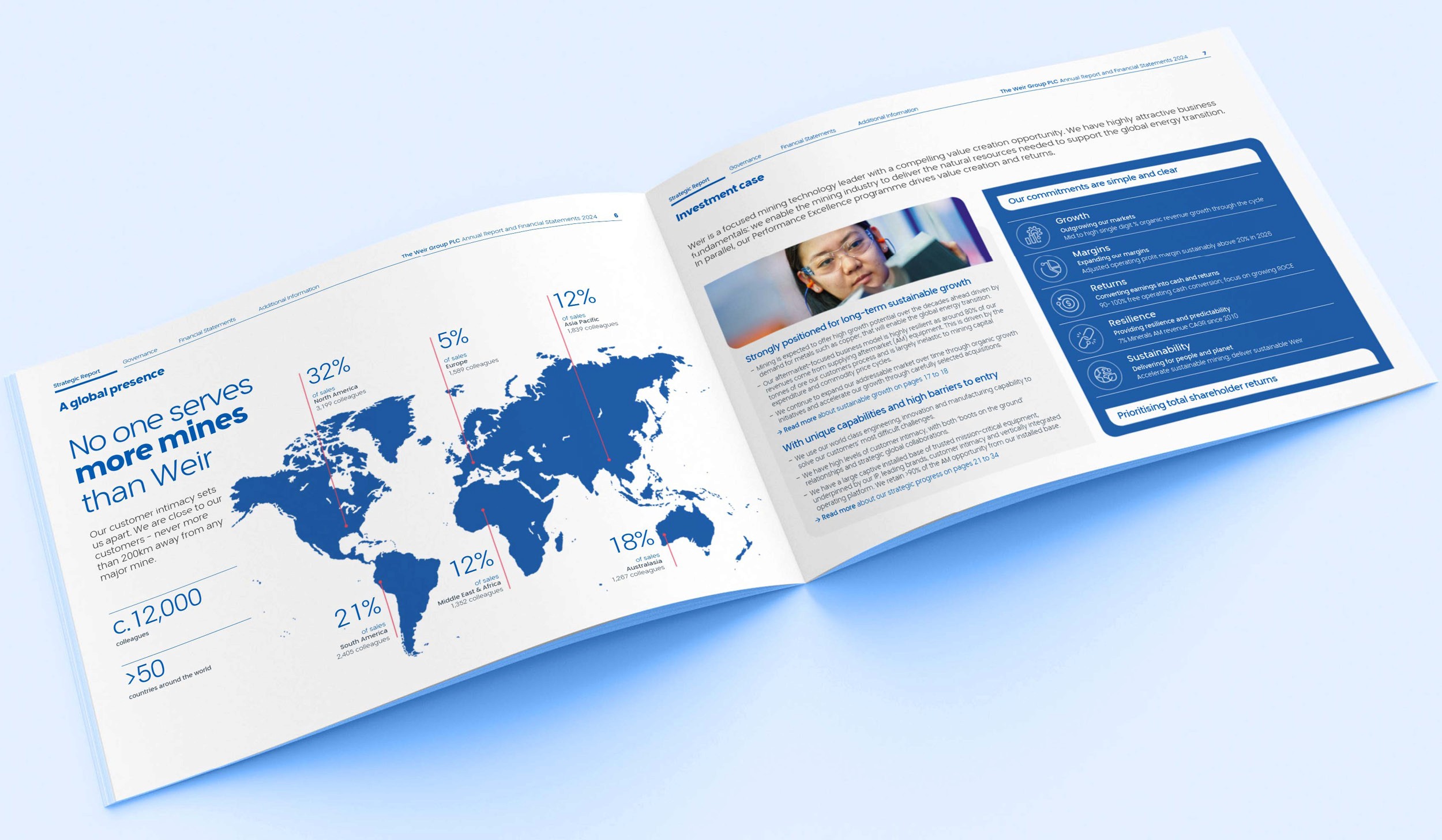
I introduced a landscape format to create a more dynamic editorial experience, using layered visuals and a clear content hierarchy to bring Weir’s sustainability narrative to life.
Bold typography, corporate blue tones, accent colours and subtle topographic detailing created depth while remaining consistent with the evolving brand. Clear signposting and integrated links to digital content further improved navigation, resulting in a contemporary, accessible and cohesive annual report.
I introduced a landscape format to create a more dynamic editorial experience, using layered visuals and a clear content hierarchy to bring Weir’s sustainability narrative to life.
Bold typography, corporate blue tones, accent colours and subtle topographic detailing created depth while remaining consistent with the evolving brand. Clear signposting and integrated links to digital content further improved navigation, resulting in a contemporary, accessible and cohesive annual report.
I introduced a landscape format to create a more dynamic editorial experience, using layered visuals and a clear content hierarchy to bring Weir’s sustainability narrative to life.
Bold typography, corporate blue tones, accent colours and subtle topographic detailing created depth while remaining consistent with the evolving brand. Clear signposting and integrated links to digital content further improved navigation, resulting in a contemporary, accessible and cohesive annual report.

Neece Studio
© Neece Studio 2026 / ALL RIGHTS RESERVED.
Website design and build in Framer.
Neece Studio
© Neece Studio 2026 / ALL RIGHTS RESERVED.
Website design and build in Framer.
Neece Studio
© Neece Studio 2026 / ALL RIGHTS RESERVED.
Website design and build in Framer.